We at Silicon Publishing have come to specialize in developing online design applications, with years of extensive work building web-to-print solutions based on InDesign (yes, pre-server) and Adobe InDesign Server. Because we didn’t start with a product, but spent our first 9 years as a custom development shop, we have not tended to guide our customers on UI but have typically let them define what they wanted.
When we did create a product, Silicon Designer, we focused on the core common layer of what we had built for solutions, keeping in mind that the user interface would have to be quite different for different clients. We continue to see that different companies have wildly different concepts of what is important, even given similar document types/workflows, and there are differences between document types and business context that will in many cases require different UI approaches. We are glad we worked so hard at keeping the core functionality flexible with respect to user interface. Following are five UI considerations we see as we build online design tools.
1. Constraint vs. Freedom
One of the first considerations in an online design tool is how guided, or constrained, the design experience will be, as opposed to free-form and flexible. Do you let users add objects to the page? Do you let them start from a blank canvas and design from scratch? Can you position an image within a frame, or re-size the frame itself?
We have seen the extremes, with some very form-based, wizard-like applications for authoring content at one end of the spectrum, and more like “InDesign on the Web” at the other end of the spectrum. Some of our more sophisticated clients offer a more simple experience for one class of user, with an “advanced” mode for “power users.”
Here, it really depends on the nature of the content and the end user. For many clients, brand management is an important concern, and in such cases a constrained interface usually makes more sense. A Real Estate agent making a brochure will want to go quickly and will want to stay within the constraints of a template, getting the job done as quickly as possible.
It is a more difficult choice when, for example, you are letting users design a greeting card, a personal magazine, or a photobook. Here is where we see strong opinions one way or the other on exactly the same document type/user type. There are tradeoffs:
- Shouldn’t users have the ability to quickly get in, make a document, and have it come out right with minimal risk?
- Shouldn’t users be able to make their own unique document their own way, with features one would expect from a desktop layout program?
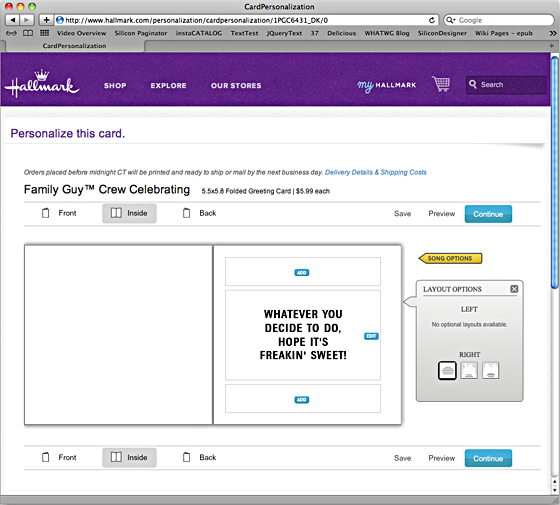
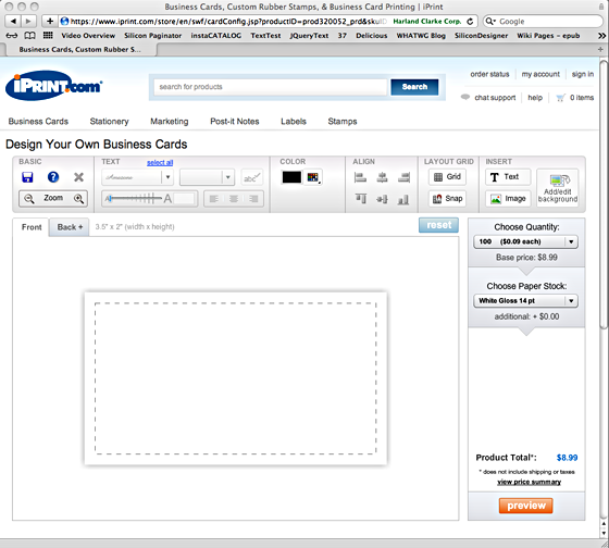
We have witnessed passionate arguments within organizations on this subject, and worked on applications in the extremes. Hallmark.com is an example of a fairly constrained experience: iprint.com is very free-form. One consideration is that a constrained UI is usually easier to implement, while with a free-form editing experience, one thing leads to another. So a user can add objects to a page… next you will probably want to align these objects, somehow. Alignment tools, snap-to-grid, and other features follow such an initial opening up of free-form editing.
We have seen organizations bring data to justify one position or another. One chart, for example, plotted Complexity on the horizontal axis, with a triangle indicating the Market Size for the spectrum of applications, and it came out something like this:
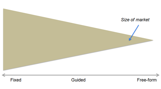
I saw this chart and had a revelation – no wonder we are so poor! We toil and toil to make “InDesign on the Web” sorts of application, but these are so complex and esoteric, they make users abandon sessions from confusion/exhaustion, or render documents unprintable with terrible design choices; all our work to let them add and contort images to their hearts’ contents is entirely wasted! All the money seems to come from the old school, form-based “enter book title and you’re done” sorts of application, built by old-school programmers who don’t know what kerning is, who have never studied the mathematics of zoom and rotation. So that’s what is meant by “less is more.” Sorry Ole, you are too smart to work here. 🙂
Fortunately for us, the larger players in online editing do actually appreciate the value of free-form editing, as something to shoot for after there is an established “easy way” to create documents. The art is in balancing constraint and freedom in such a way that users can work quickly and are guided towards a successful design, yet can still work in a free-form way when it is really needed. Often this means some form of “advanced” editing mode. The good news for those that don’t have a gazillion dollars for a pen tool that does perfect gradient mesh touchup is that only 1 in a billion users will ever use such a thing, and the one that will probably won’t buy anything.
2. Direct On-canvas vs. Form-based Editing
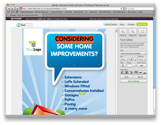
One paradigm users are familiar with from word processing software and desktop design tools is the ability to edit text or manipulate images directly on the canvas. It is probably most intuitive, if you see an image of a greeting card (as at Hallmark.com) or a business card (as at iPrint.com) to type right on the document, as is in fact the case with Hallmark, iPrint, and Flyerzone.co.uk (below).
This is somewhat challenging to implement, yet it has become extremely commonplace and almost expected with online editing. Still, even if you have the ability to do something on the canvas, is that always the best way to do it?
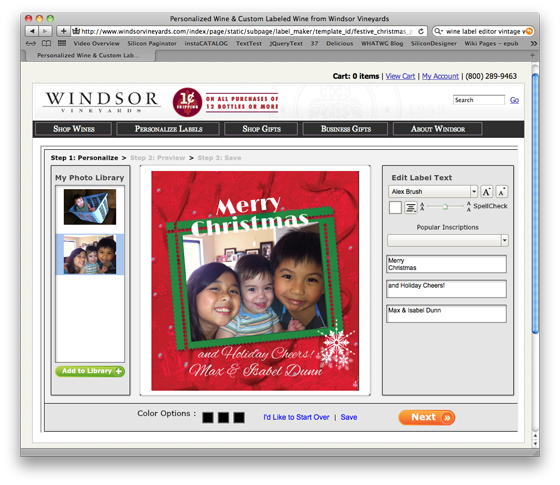
Again, there are different use cases, and strong opinions either way even in similar situations. The chart above would tend to speak to the value of form-based editing, while the most common argument for direct, on-canvas editing is “that is what users expect.” One of the most simple form-based interfaces we have created is the wine label maker at WindsorVineyards.com – it is extremely quick and straightforward to make a label.
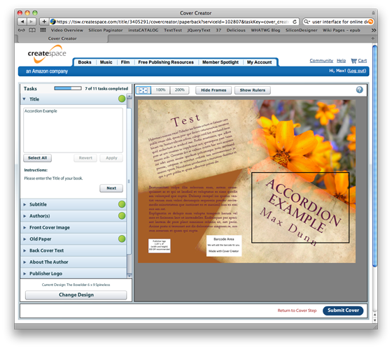
Form-based editors typically have a form to the left or to the right of the canvas in which all fields are entered, and (instantly or near-instantly, we’ll discuss this below) updated on the canvas. Sometimes the fields are presented as an “accordion” in which the current active text field expands while the others collapse, as in the Createspace.com example below. This can be convenient when there is alot of information to enter.
Images can also be edited directly or via some form of pop-up or form. Moderngreetings.com, for example, is generally one of the more free-form sites out there. In the case of images, they allow users to drag and resize the frames themselves (not so common). Because they do this, they provide an “Edit Image” dialog to do image cropping. Users have to work in a form-based window to reposition an image within a frame.

3. Navigating and Tracking Progress
The longer and more complex the document, the more effort should be put into letting the user navigate around through different pages or panels, or possibly through different documents that make up a kit, as well as giving users a clear indication of where they are at in the process. The Createspace example below, for example, has a green circle that will show up in each accordion item when it is completed, as well as a “Tasks” indicator at the top of the accordion giving a status bar of progress and a count of those items completed and those remaining.
Here again we have debate among our clients as to how far to go. Some feel that excessive visual indication of “status” can impede the creative process, others insist that guidance and real-time indication is important to helping users complete the design session without abandoning the session. There is the choice, for example, with multi-panel or multi-page documents, as to whether to even let the user go to another page/panel before the first one is complete.
4. Visualizing the Whole Product
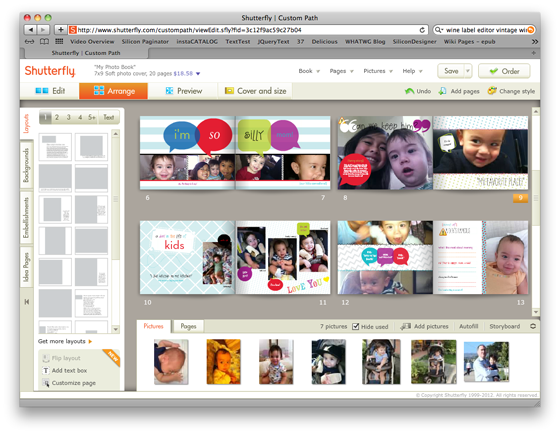
Different sorts of documents present different challenges when it comes to visualizing the entirety of what is being created online. With greeting cards, for example, often it is nice to see two panels side by side: it may also be nice to have animation that shows the card being unfolded. In some situations, users are creating multiple pieces that are associated: we have seen some animate the finished card being inserted into the finished envelope, for example. With pagination, it is important that users know they have actually edited all the pages in the document: often paginated documents are presented with some form of “page flip” technology to give the feel of the final experience. Shutterfly.com‘s Custom Path application offers several ways to visualize product, from a page-flip view to sequential pages to tiled pages.
Dimensional products offer even more complex challenges for visualization, which is something we are working on currently. Technology for 3D is just starting to be sufficiently robust to support editing in an environment that can concurrently render in 2D and 3D: most current approaches will have a 3D model for navigation and visualization, which pulls in 2D snapshots from the editing of each surface. Between further advances with Flash, CSS and WebGL in the HTML5 space, and general hardware acceleration, it would appear we will eventually be in 3D space throughout the editing experience.
Sometimes the design tool itself is integrated in such a way that it doesn’t have the whole picture of what the user is creating. For example the tool will be invoked by a wrapper application such as a shopping cart, for editing a magnet and its associated envelope, or a CD cover and liner notes. In such cases it is typical for the design tool to pass to the wrapper application sufficient images so that the aggregated end-product can be visualized.
5. Balancing Server- vs. Client-side rendition
Finally, there is a consideration that should leave little room for debate about what is best, yet which is an important consideration with any online design application: when to render on the client vs. the server. In general, the rule is “render on the client, if at all possible” yet there are both times when it is not possible to render on the client and there are some application architectures where server-based rendition makes sense for some reason.
When we began building InDesign Server–based web-to-print solutions, WYSIWYG authoring was not an easy thing to do at all. If you look at Createspace.com, which we inherited from the Adobe Dandelion project, it is the old-school method of “enter text, hit the server, and wait for the image to render.” With Flash 10 and the Text Layout Framework that came with the Flex 4 Beta, we gained much more fine-grained control over rendition. With CSS3 and HTML5 we now have similar control in modern browsers. It certainly has taken the web a long long time to catch up even nearly to the subtlety of typography that is taken for granted in the print world.
The essence of our base Silicon Designer product is to have a model describing documents that will render the same in a web browser exactly as it will with Adobe InDesign Server (which renders the highest quality print output). By taking this approach, user experience is instantaneous: as you edit in real time on the canvas, or via a form seeing the canvas update instantly, you can be confident that the print output will match what you see on the screen. This is a much better experience than waiting around for a preview to come back.
That said, there are a few contexts in which you may wish to hit the server to render output:
- Thumbnails are often a requirement – for example when you see a greeting card you personalized in your shopping cart, it is preferable to have the thumbnail reflect your personalization. Not everyone does this, but most do this if they can afford to. So for thumbnails alone, you may hit InDesign Server to get back an image. It is possible to create thumbnails on the client and send them back, yet the internet connection and client bandwidth make this risky to rely on for all users.
- Some types of document objects may be tough to create on the client in the same way that the server will do them. Text on a path in InDesign, for example, may be something you would be better off rendering on the server and feeding to the client, unless you have mastered making selectable text in the web environment behave the same way.
- Sometimes a complete design interface is simply not available, and a form-based interface hitting a server is the way to go. For example there may be a tiny form in the middle of a commerce app to create a label, where a full-fledged design tool is inappropriate.
- Sometimes devices are limited in their capability to support WYSIWYG online design, and those devices may be fed a form-based creation tool that has limited capability compared to what is sent to more robust devices.